Redesign all the members sites membership page and checkout process
Skills: Data analysis, User research, Figma, HTML5, CSS3, Bootstrap 4, Javascript(vanilla), Google Analytics Timeline: 6 weeks
Objective:
To change the designs of all the 22 members sites membership page and checkout process to improve our key KPI the conversion rate.
Step 1. Gather data
I conducted two analyses, one being an in-depth evaluation of the Google Analytics data I could access on the conversion rate for the membership page and the checkout process. The second utilized user surveys to identify pain points and challenges faced by users during the process.
Step 2. Competitor analysis
In order to find out how I could make the process simpler for the user I decided to look at other sites which had a journey for a user who could purchase a subscription. In addition, I look at other competitor webstes, who had lists of membership benefits, to find out how they made the content easy to read and understand. The site which I took most inspiration from was Netflix's site which had several columns for memberships, which at the time was similar to the design of the members sites membership page, but had a limited amount of text for the benefits and used icons to signify whether the benefit was active or not.
Old designs
This was the style and journey of the old design:
Step 3. Prototyping and Design
I developed high-fidelity prototype designs in XD based on data-driven insights and then collaborated with the internal team, iterating designs for optimal impact.
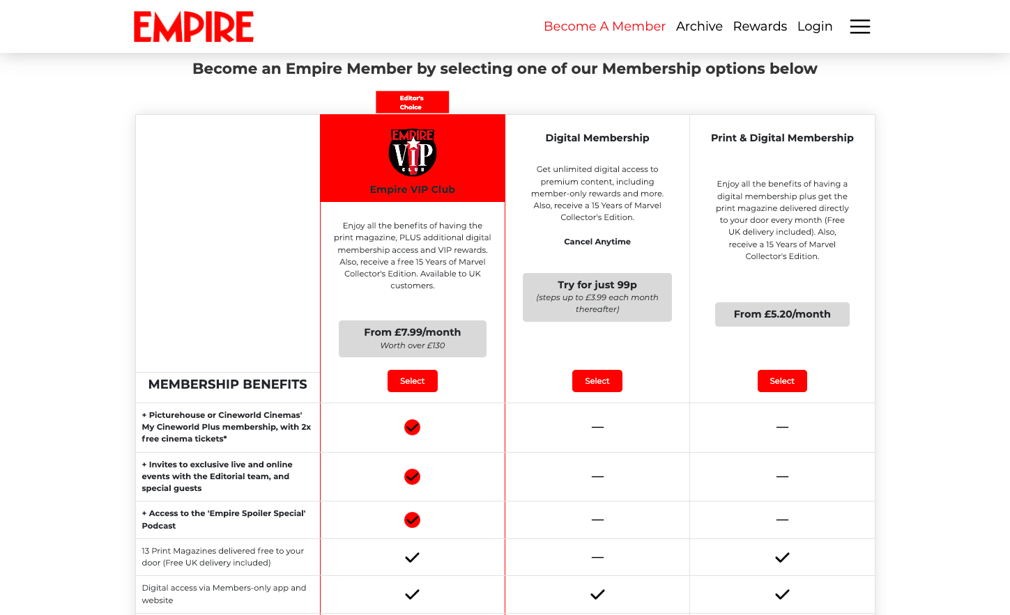
Membership page new design:
First iteration:
Second iteration:
First iteration of the new design of the checkout process:
Second iteration of the new design of the checkout process:
Step 4. Implementation
I translated approved designs into front-end code using a responsive framework and integrated UI kits to ensure seamless functionality. The priority was the mobile user experience due to the majority of traffic originating from mobile devices.
I conducted rigorous testing to identify and rectify any potential bugs or issues to ensure a flawless user experience before implementation.
Step 6. User Feedback
I administered SUPR-Q surveys, gathering user ratings out of 5 and 10. The test received outstanding scores: Usability: 4.3 and 4.2 out of 5. Trustworthiness: 4.1 and 4.4 out of 5. Appearance: 4 and 4.3 out of 5. Loyalty: 8.1 and 7.7 out of 10.
Step 7. Results
There was a remarkable improvement in the conversion rate, surging from 0.15% to 0.8% on a monthly basis. There were consistent enhancements observed at each stage of the membership funnel, reflecting the project's success.
This is a video of the membership page and the checkout process in action:
Here are links to some of the members sites membership pages which are still live:


-1.png)
-2.png)
-3.png)
-4.png)
-5.png)
-6.png)


